
Apr 21, 2011
Brave New World around the corner
I just got a banner ad in Yahoo mail for a situation where "Child forgot his homework"? "All you have is tears?" "Here's a drug for you..." Do people really think this is the right path? Every medication has consequences. Here's why people need to read science fiction... to at least hypothesize what the effect of their actions might be.

Apr 19, 2011
We: Fonts
Looked at some futuristic fonts for the We book. I settled on these:





Circuit


Pole Position

Republika


Rough Draft

Space Age

Also, it would be interesting to look at treating the fonts with a "lightsaber glow", similar to: this video intro.

We: A Visual Interpretation
For my graphic design course at MCAD, we need to create a printed media composition. We have only two more weeks to create the final project so I figure I'd better start working on it. I'm not that creative under pressure, I need time to weed out the bad ideas and tweak the good ones.


I wasn't definite on a direction so I gave the instructor, Jenny Tondora, several ideas to play with. She responded that she liked the idea of the book/perhaps droid version of an artistic word book on the concept of Zamiatin's We, a ground-breaking distopian novel written in the 1920s.
I've long thought this would be a good novel to make into a Motion Picture, but the pitch I need is to develop a storyboard to go along with a screenplay for it. With this assignment, I don't have time to develop the whole storyboard, but perhaps instead come up with the pitch, the narrative preface to what the work is about.
First step: finding my copy of We I received two years ago at Christmas from Quincy (One book in a house full of books is sometimes time-consuming and stressful).
Second step: installing photoshop/tablet software on the laptop.
Third step: thinking about the kinds of layout I'd like to do.
Creative/artistic elements
1. Words/quotes - quotes from the book, settings, persona, literary comparison to similar works
2. Silhouettes - images silhouettes of people white on black, strong contrast, using photoshop to
3. Ideation - do I have time to compose some brain maps such as using Freemind?
4. Font gathering/focusing/selection
5. Futuristic objects/buildings/cities
Futuristic Inspirations:
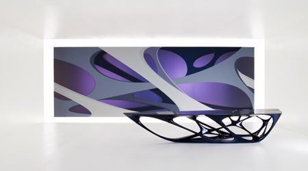
Furniture: Zaha Hadid
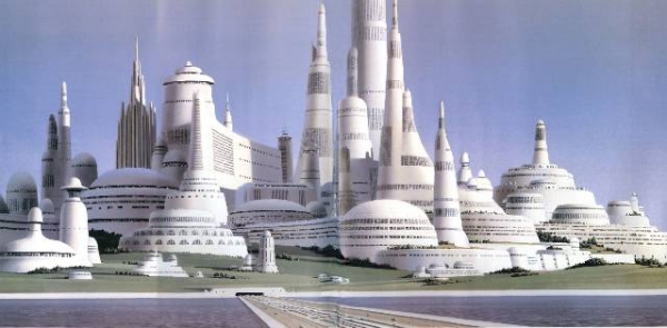
Cities: Ralph McQuarrie


Apr 10, 2011
MCAD Design Week 2: Elements and Principles of Design
Using a shape and only black and white, illustrate the five concepts: similarity, continuity, closure, proximity, and foreground/background.
1. Similarity


MCAD Design Week 1: Examples of Good and Bad Design
1. Road Signs
a. Good. In these standard road signs, the meaning is clear. Something is happening which affects the road. The road is represented by the solid black line. In the first merge example, there are two before and one after. Clearly action must be taken to merge.

b. Bad. In this version of a merge sign the road is now indicated by its boundaries, and the insinuation is that the flow inside is constricted. But using the same metaphor as the good signs will lead your eyes to believe the model where some of the roads get just a little closer together, but no worry, they don't actually meet. The no passing zone sign is redundant in all situations since the same message is already indicated with solid or dashed yellow paint lines on the road.

2. Web Sites - respecting the visible area
a. Bad. These are two websites don't respect vertical or horizontal screen real estate. In the first, x10.com's bizarre home page delivers a whole web site of information in a single bottomless HTML stream rather than navigating to other pages for different topics. Www.anthem.com is another bad site but it takes the horizontal approach to unlimited screen real-estate. It's a common mistake by designers/developers blessed with dual large monitors to think their customers want or can afford to lose 100s of pixels of screen width for each website category color band. The most critical link in the website for a customer, the login, is far away to the right, probably offscreen on an Aspire One.

b. Good. I like BBC's sites for their clean look and feel. Radio1 has a slit-screen photograph feel that gives a techy edgy feel, a symbol which carries over as an animation to their player/streaming component. The colors are a little flamboyant but they harmonize. Catering to the customer, the dj/show search link is ready available at the upper left.

3. Web sites - consistency, fonts
a. Good. I saw this font on a student organization's mural on the Washington Bridge: Innovative Engineers. To me, that font is pure tech. It's inspirational like a Science/Tech/Eng/Math STEM counterpart to those groovy 60s music poster fonts.

b. Bad. CIA Factbook:The CIA releases a handy wealth of information about countries in the world. This is a great site for consise information - determining population, currency, politics, religion, etc. I like the site information, and the style within the "c-clamp" area.
There is not a consistent style for the site. There are over 5 fonts used on this page alone. To the left and right, an attempt is made to make the sidebars 3-dimensional. But this falls short as the shadow changes from the left to the right side.
Is usability part of graphic design? If so this is also an issue I (currently) have:
In the last couple years, they decided to change the layout of the page so that when you first come in, all the information is hidden. I call this the IMDB approach. IT COULD be easy to scroll, search using your browser for information on the page, but because it starts out as hidden (unexpanded) you can't see it. If you have a slow enough/wireless connection you can even see it for a second before they use script to hide it.

Apr 9, 2011
Programs as vectors
This was brought up because someone mentioned the expression problem in a talk today about an introduction to closure.
Swung over to remembering this concept I expressed at Lawson Software, that of a complete, working program as a vector of components. Each component has a different version, expressed as a number line in the version repository. We could manufacture different libraries in the framework where every program is layered on top of the libraries it requires.
FOSD cubes are a software engineering expression for a multi-product line. My belief is that this is similar to a multi-objective programming model. In order to provide the best "next release" of a program for a client, they could express their interest based on their objective function - they want the latest, best version that meets the "works best = known tests pass" for a particular line such as the HR system. You would then use multi-object programming techniques to find the preferred solution.
Swung over to remembering this concept I expressed at Lawson Software, that of a complete, working program as a vector of components. Each component has a different version, expressed as a number line in the version repository. We could manufacture different libraries in the framework where every program is layered on top of the libraries it requires.
FOSD cubes are a software engineering expression for a multi-product line. My belief is that this is similar to a multi-objective programming model. In order to provide the best "next release" of a program for a client, they could express their interest based on their objective function - they want the latest, best version that meets the "works best = known tests pass" for a particular line such as the HR system. You would then use multi-object programming techniques to find the preferred solution.
Subscribe to:
Posts (Atom)